Hello, GibbsStudio Community!
We’re thrilled to announce a new feature that will help you in your plotting. GibbsStudio now supports Error Bar Plots, a powerful tool that allows you to visualize the variability in your data and communicate uncertainty more effectively.
Why Error Bars?
In any data-driven analysis, conveying the precision of your measurements is crucial. Error bars give a visual representation of the variability or uncertainty in your data, helping you and your audience make more informed interpretations. Whether you're working on scientific research, business analytics, or any other field where data accuracy matters, error bars are essential for:
- Displaying variability: Show how much data points deviate from a central value, like the mean.
- Visualizing confidence intervals: Clearly present the range in which the true value is likely to fall.
- Comparing datasets: Easily compare the reliability and variance between different datasets.

How to Use Error Bars in GibbsStudio
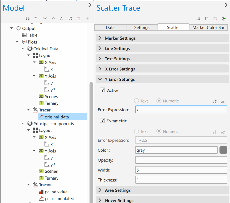
We’ve made adding error bars as a new feature in the Scatter Series Trace:
- Check the Active checkbox button for the Error X or Error Y panel: This will enable the error bar capability in the plot
- Add your error mathematical expression: Assign the variables associated to the error. As always, you can use mathematical expressions if you wish.
